About
Work
Contact
DESIGN
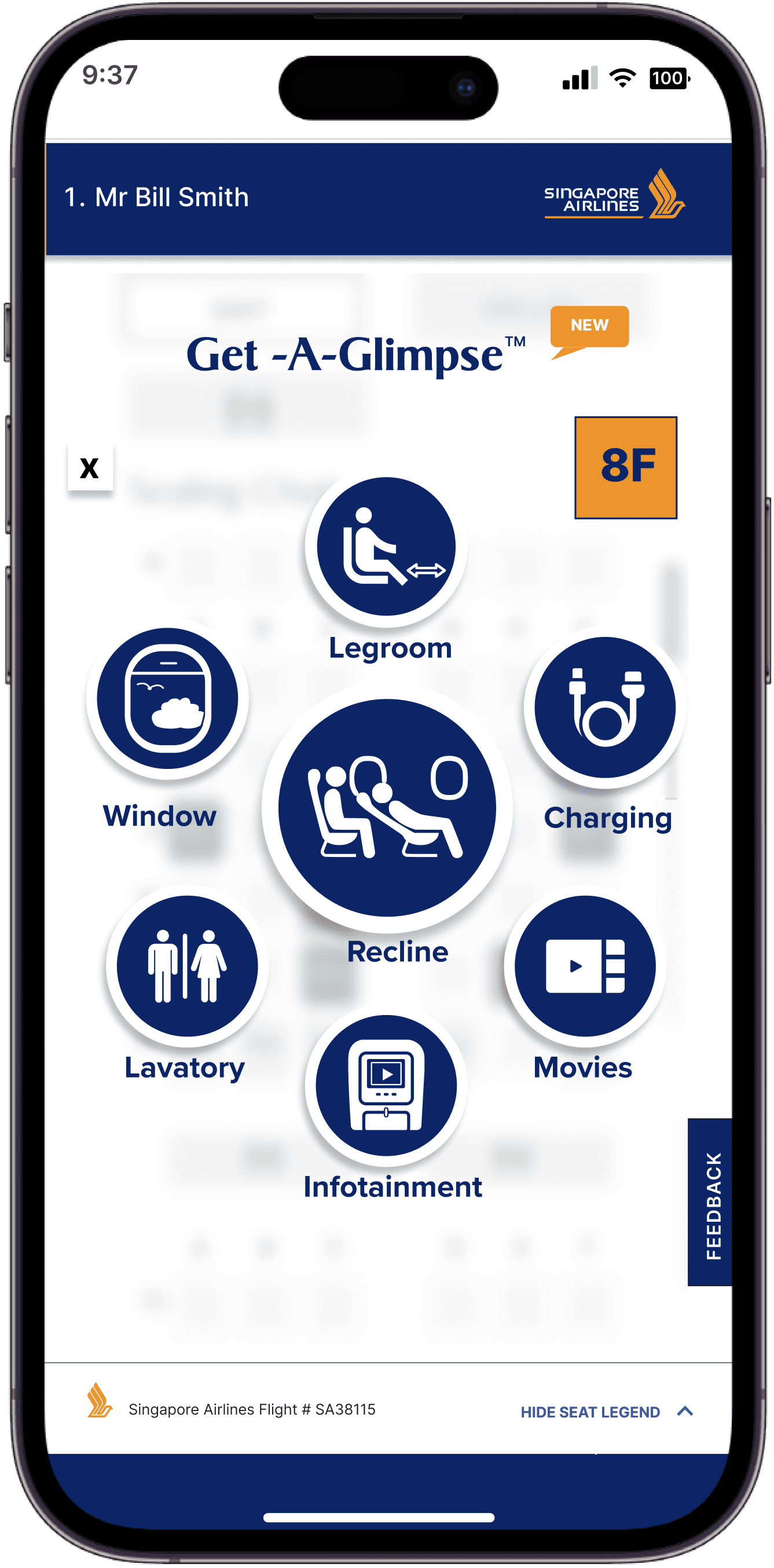
Get-A-Glimpse
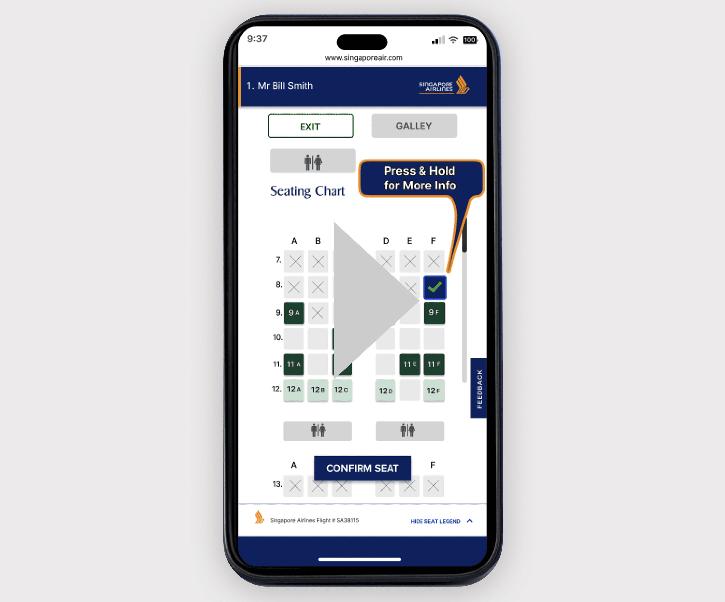
Adding a simple but effective feature the Singapore Airlines websites

View Prototype
ROLE/TEAM
Project Manager
Sole UI/UX Designer
TOOLS
Figma - Adobe Illustrator - Zoom - Lookback.io
DATE/DURATION
4 wks - 80 hours
The Problem
Users want a lot more information when book airline tickets
The Goals
The goal for this project was to enhance the user experience for Singapore Airlines by adding new features at seat selection so traveller's can make better choices prior to them purchasing their airline tickets. As business goal i think this feature could enahnce the ticket buying experience this leading to more sales perhaps more revenue etc.
Background
Problem
Solution
My Approach
Research
Design
Wireframes
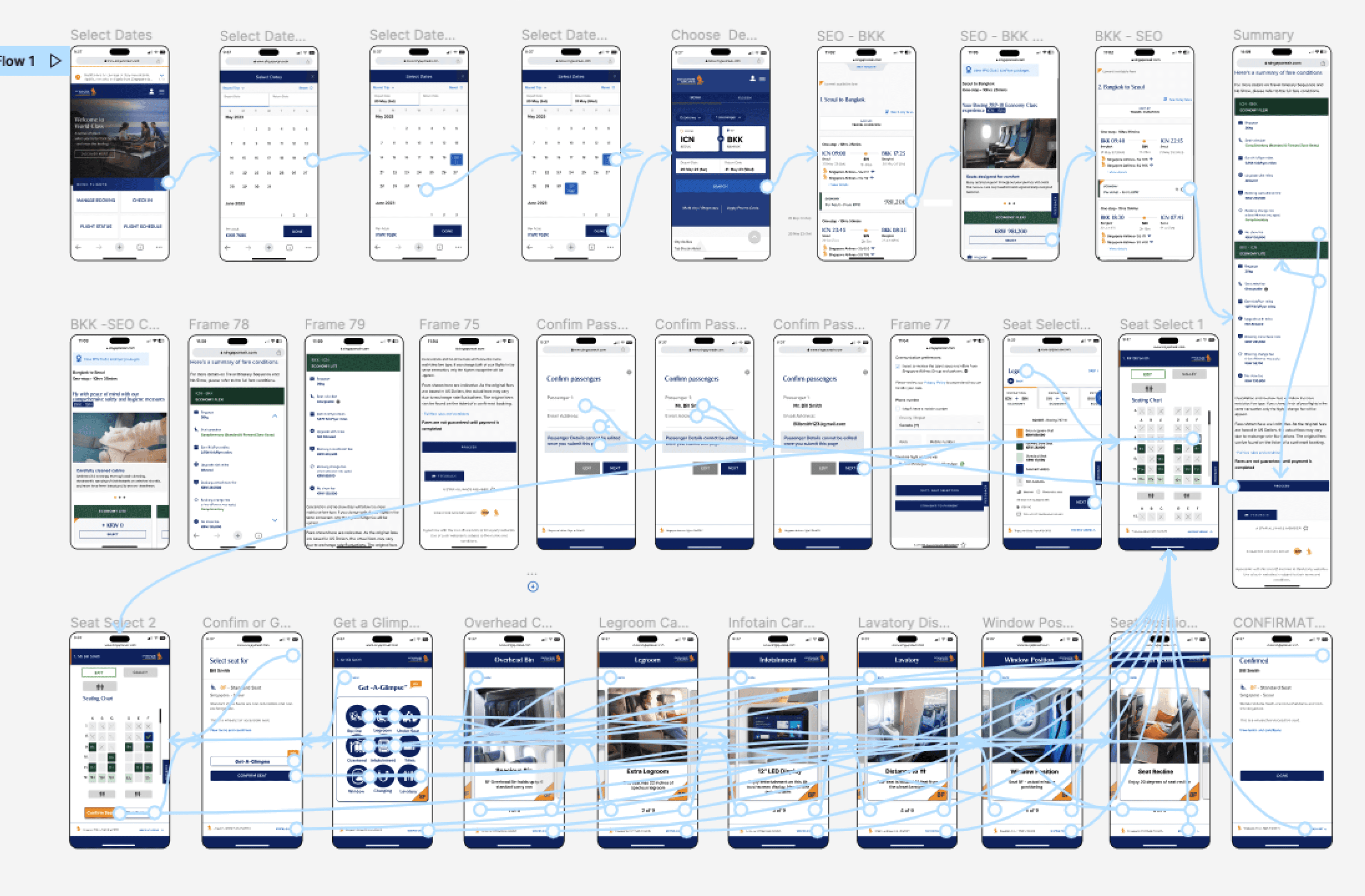
Prototype
Reflections
While booking airline tickets online specifically during seat selection there is a lack of relative information available to customers who might find this information useful when choosing seats on any given flight.
The problem arose when on one particularly long flight where I had chosen a Window Seat at booking but after boarding the plane, I realized that the window at my seat wasn't positioned right next to me at all but rather 8 inches behind me. I was frustrated and felt a little duped by the airline. This prompted me to wondered why airlines lacked these details and other useful information at booking.
Background
My Approach
My Approach
01
02
03
04
05

Research
Define
Design
Testing
Iterate
I used these 5 methods to achieve my goals for the project
RESEARCH
5 interviewees
Uses who have tattoos or might be planning on getting one soon
Conducted over zoom calls over 1 wk
Questions were:
Results: How many people liked dislike would visit would not?
Next actions taken
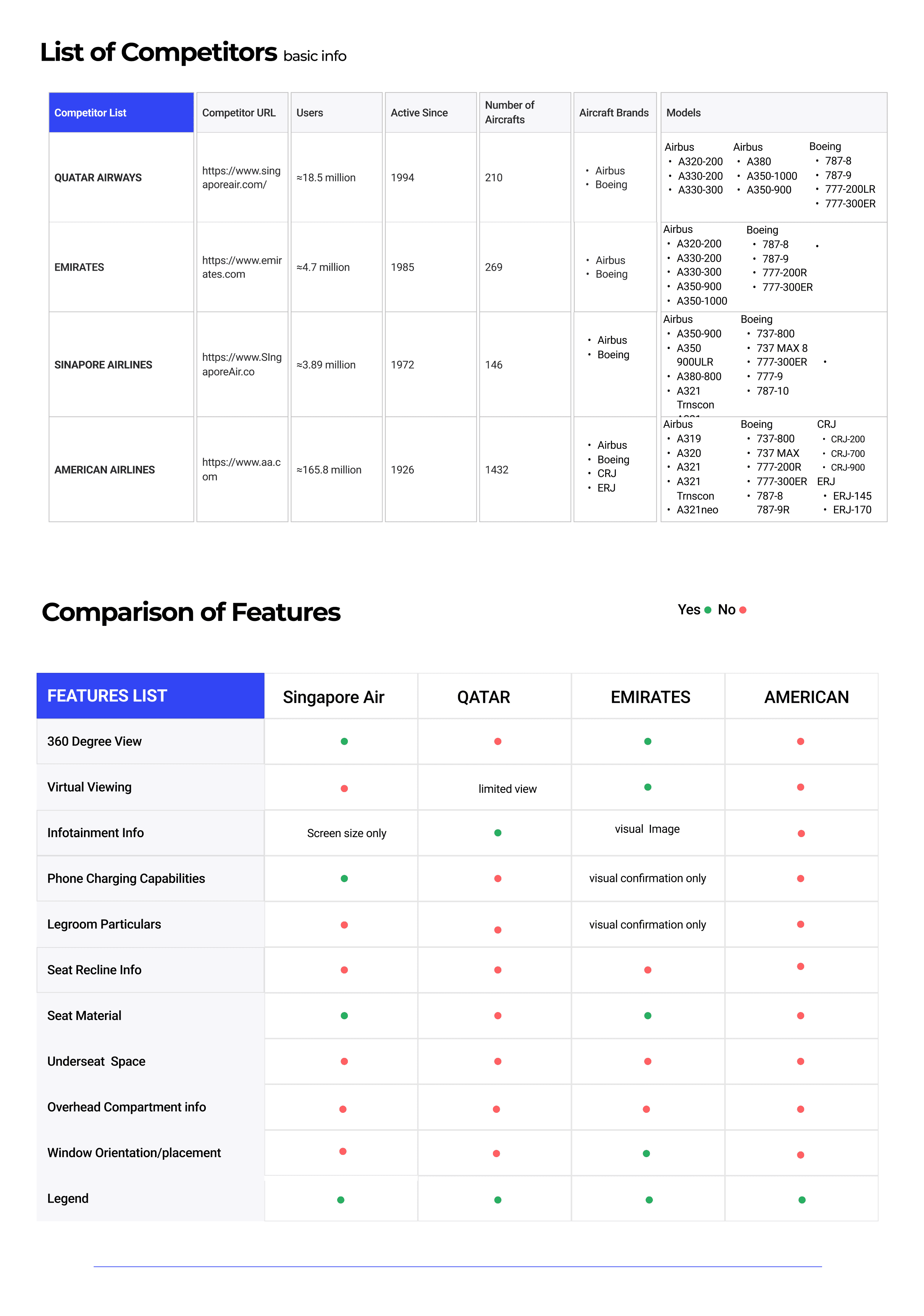
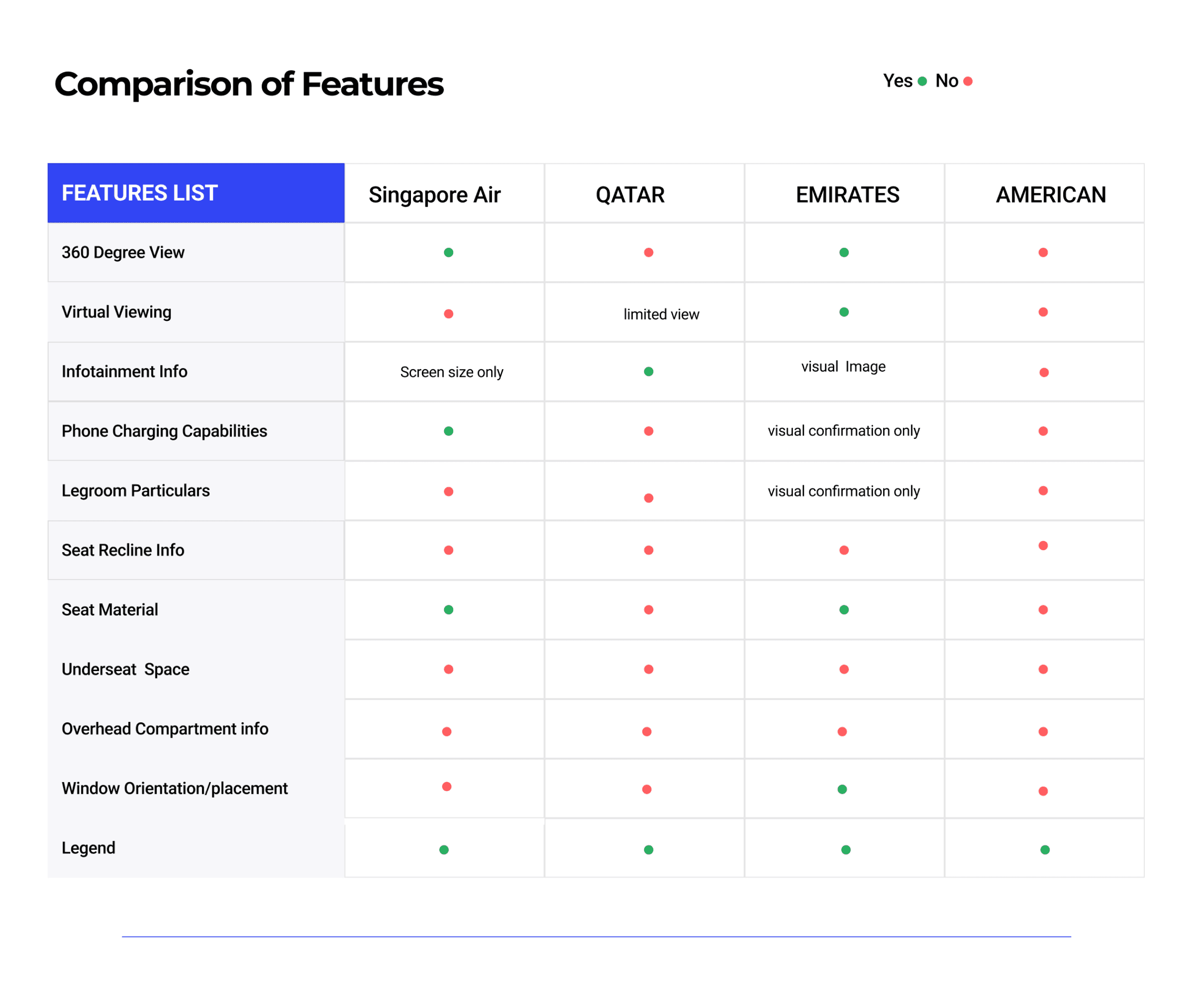
Research Consisted of User Interviews and Competititve Analysis
RESEARCH
Competitive Analysis
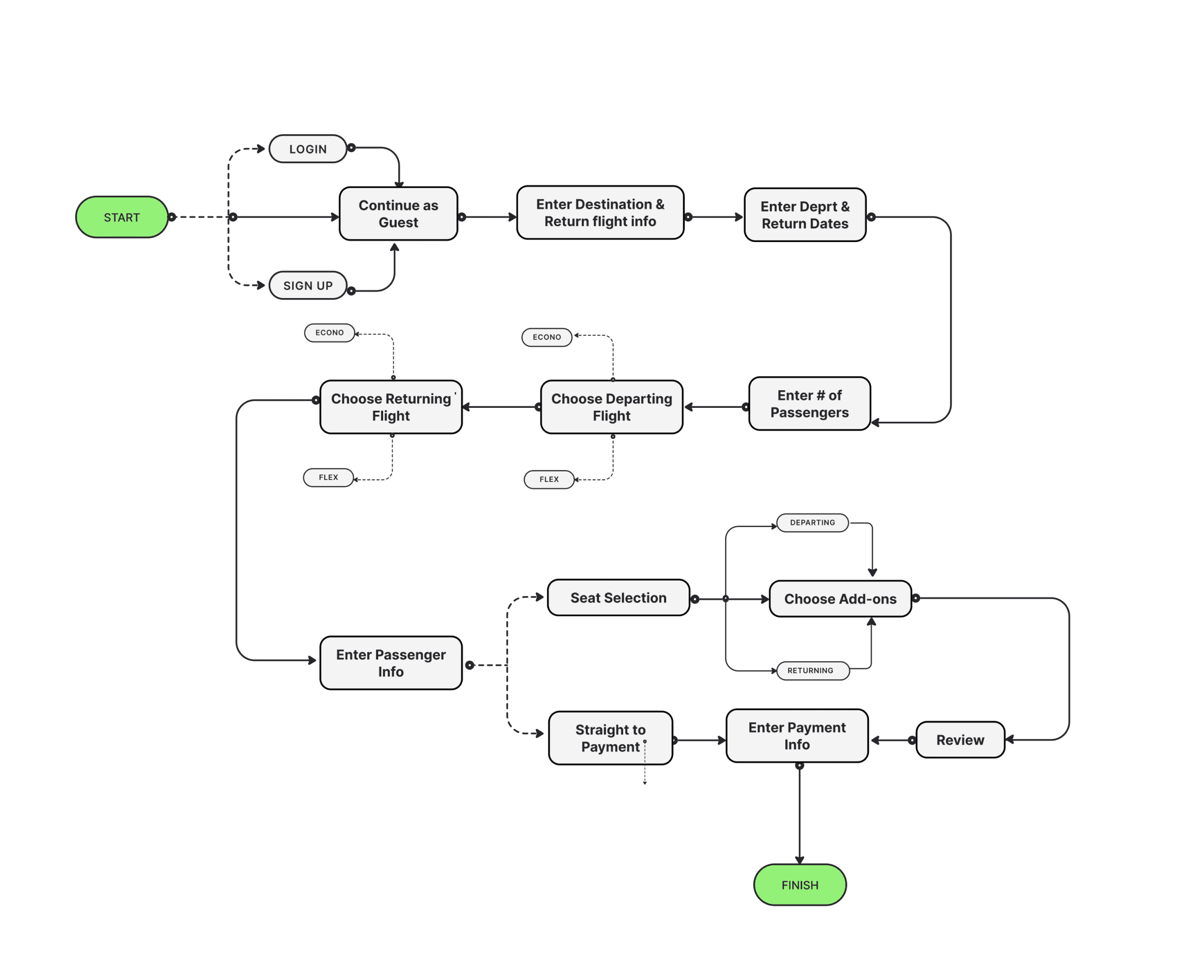
User Flow/Journey
In order to envision what each of the personas would need as they were to navigate the feature i created a user journey based on their goals.
Concepts, Sketching & Wireframes
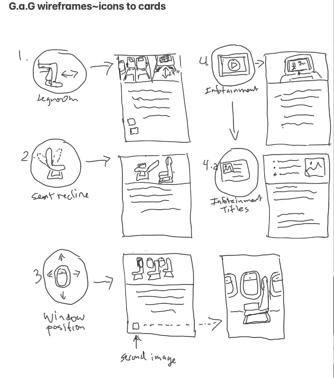
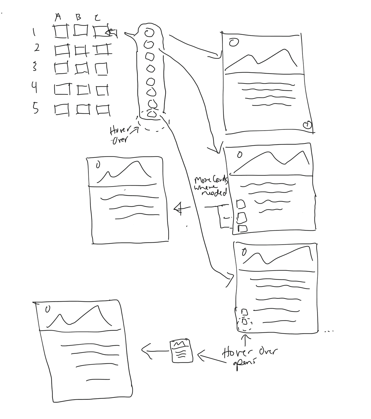
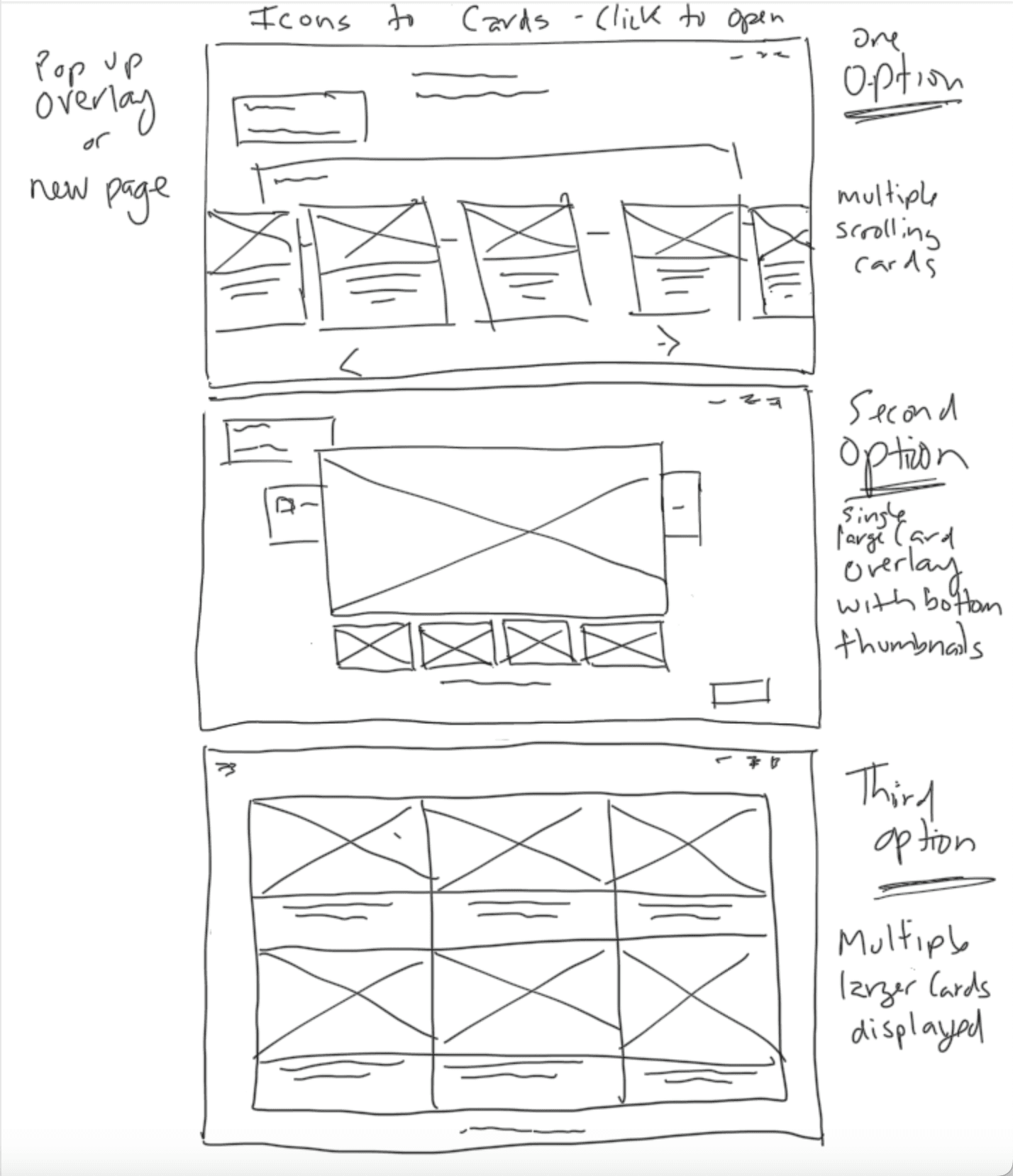
With the user flow/journey complete i was able to better visualize the needs for this new feature. I started by sketching ides on to paper fleshing out the look of the icons represent the different features.
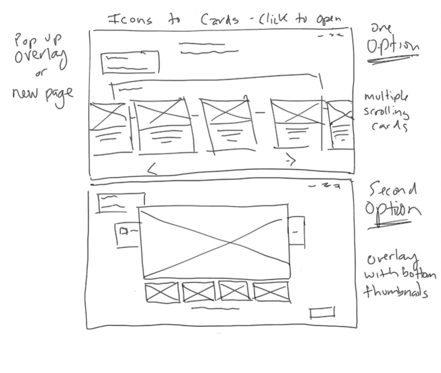
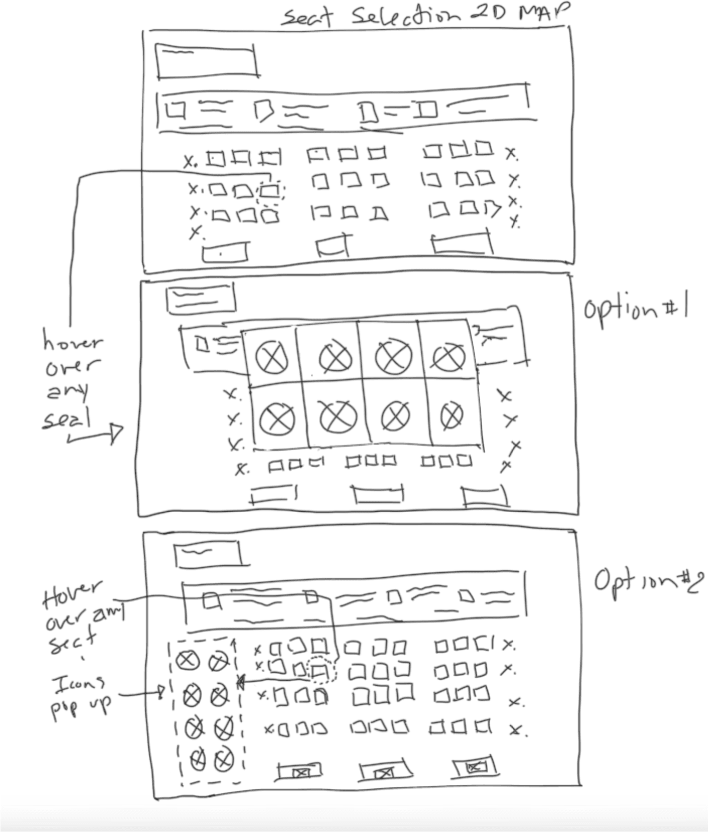
Mid Fidelity Wireframes
With the user flow/journey complete i was able to better visualize the needs for this new feature. I started by sketching ides on to paper fleshing out the look of the icons represent the different features.
Mid Fidelity Wireframes
WireFrames
Concepts, Sketching & Wireframes
User Flow/Journey
Cam Jackson
About
Wants & Needs
Pain Points
Cam is a busy freelance photographer who loves to travel around the world to capture stunning moments with his camera. He is always on the go and needs to book flights frequently. Cam values comfort and convenience while traveling and wants to ensure he has a comfortable seat during his flights.
Cam's biggest challenge is finding flights that meet his preferences and budget. He struggles to find enough information about seat features during the booking process. As a taller guy he needs to know about seat size as photographer he needs to know beforehand the charging options for his laptop and ipad and whether there’s enough room for his camera backpack. Cam wants to easily select his preferred seat and view all the available features and amenities
London, England
Internet
Social Media
Online Shopping
Gadgets
Single
Photographer
33 yo
Struggles to find enough information
Finding flights that meet his preferences & budget
Wants a simple and user-friendly flight booking interface
Frequent disappointment after his flight.


“ Travelling is a big part of who i am comfort is a must ”
Jill Snyder

About
Wants & Needs
Pain Points
Jill is a hardworking and ambitious young woman who has been working as a pharmaceutical sales representative for a few years now. She is passionate about her job and enjoys meeting new people and building relationships with healthcare professionals. She has a busy schedule and often travels to different cities and towns for work
Jill number one priority when flying is comfort. Having information on how much her seat can recline and how much legroom is available to her is key for a comfortable and relaxing flight.
Seattle, WA
Internet
Social Media
Online Shopping
Gadgets
Single live in BF
Pharmecutical Sales
26 yo
Former college athlete with lingering injuries
Struggles to find flight details with specific seat information
Taller than average person so she needs ample legroom


“I just want to feel comfortable and that I got a good value whenever i fly”
In order to justify the design decisions I was about to make, I developed these personas to further validate those designs prior to implementation. I referenced these throughout the design process.
PERSONAS
HI Fidelity Wireframes
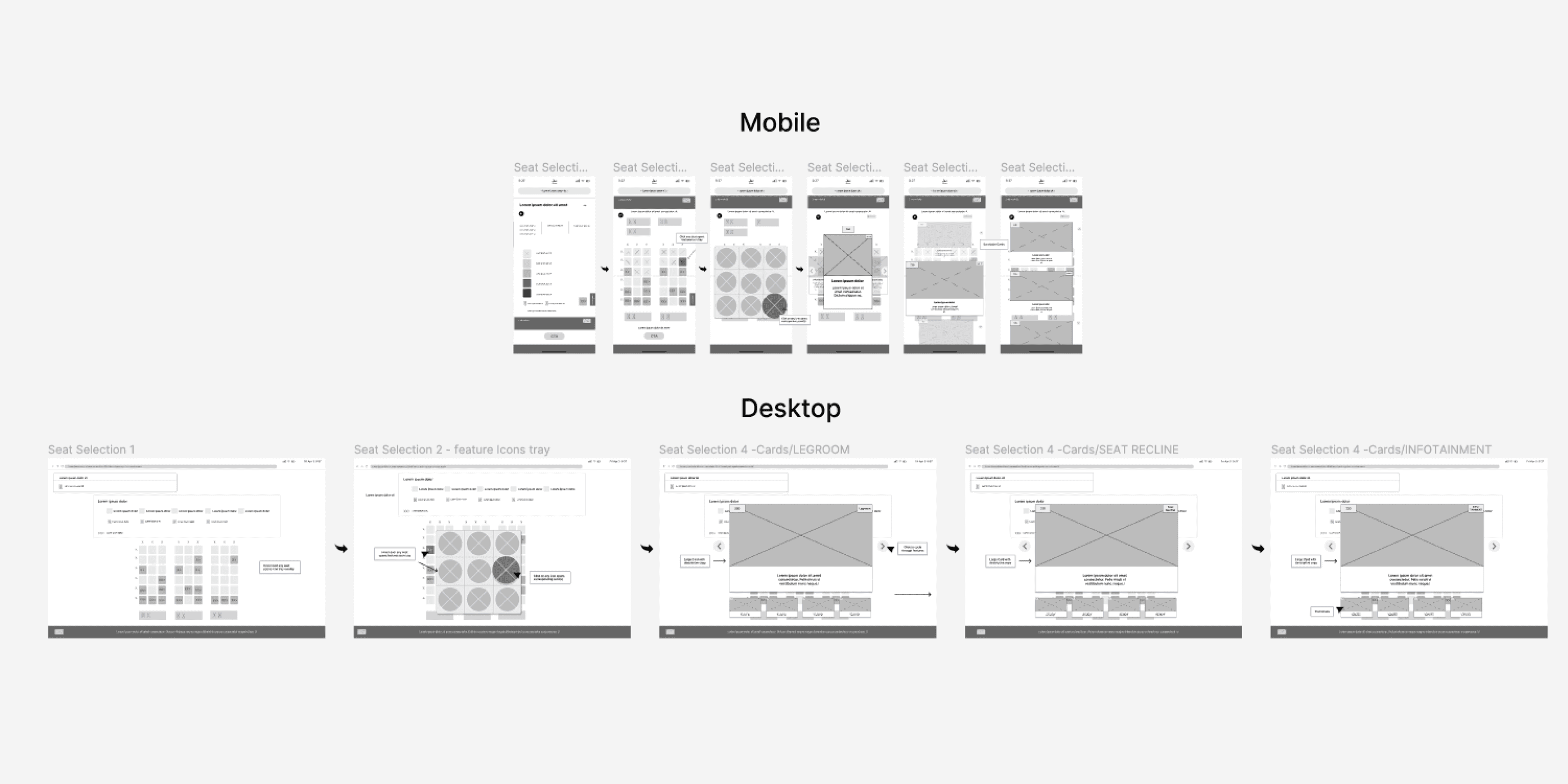
With the user flow/journey complete i was able to better visualize the needs for this new feature. I started by sketching ides on to paper fleshing out the look of the icons represent the different features.
Reflection/ Key Takeaways
What I learned
Future Goals
expanding its features to encompass additional aspects of the golfing experience such as tracking scores, providing tips and tutorials
Continuous updates and improvements based on user feedback and technological advancements would be crucial to staying competitive and meeting the evolving needs of golf enthusiasts.
Designing this golf app taught me the importance of a seamless user experience, intuitive interface design, and personalized features tailored to golfers' needs, convenience for players seeking tee times will ultimately enhance their enjoyment of the game.
Reflection/ Key Takeaways
FINAL DESIGN
The Solution
A feature that provides a series of useful info at time of seat selection
Lorem ipsum dolor sit amet consectetur. Mi lobortis turpis sapien justo egestas fames. Cursus molestie a posuere. Sit condimentum mollis sit pulvinar suspendisse. Nam lobortis enim faucibus elit eget velit est.
Ullamcorper mollis vel tempus quis ac egestas fames. In pretium lorem non phasellus tristique. Diam.
Lorem ipsum dolor sit amet consectetur. Varius eget viverra.
Lorem ipsum dolor sit amet consectetur. Varius eget viverra.
Lorem ipsum dolor sit amet consectetur. Varius eget viverra.
Lorem ipsum dolor sit amet consectetur. Sagittis sed
Nibh consequat dolor pulvinar in. Luctus sit aliquet massa ultrices nascetur turpis. Arcu
sa ultrices nascetur turpis. Arcu egestas.
Lorem ipsum dolor sit amet consectetur. Sagittis sed
Nibh consequat dolor pulvinar in. Luctus sit aliquet massa ultrices nascetur turpis. Arcu
sa ultrices nascetur turpis. Arcu egestas.
Lorem ipsum dolor sit amet consectetur. Sagittis sed
Nibh consequat dolor pulvinar in. Luctus sit aliquet massa ultrices nascetur turpis. Arcu
sa ultrices nascetur turpis. Arcu egestas.
Lorem ipsum dolor sit amet consectetur. Sagittis sed
Nibh consequat dolor pulvinar in. Luctus sit aliquet massa ultrices nascetur turpis. Arcu
sa ultrices nascetur turpis. Arcu egestas.
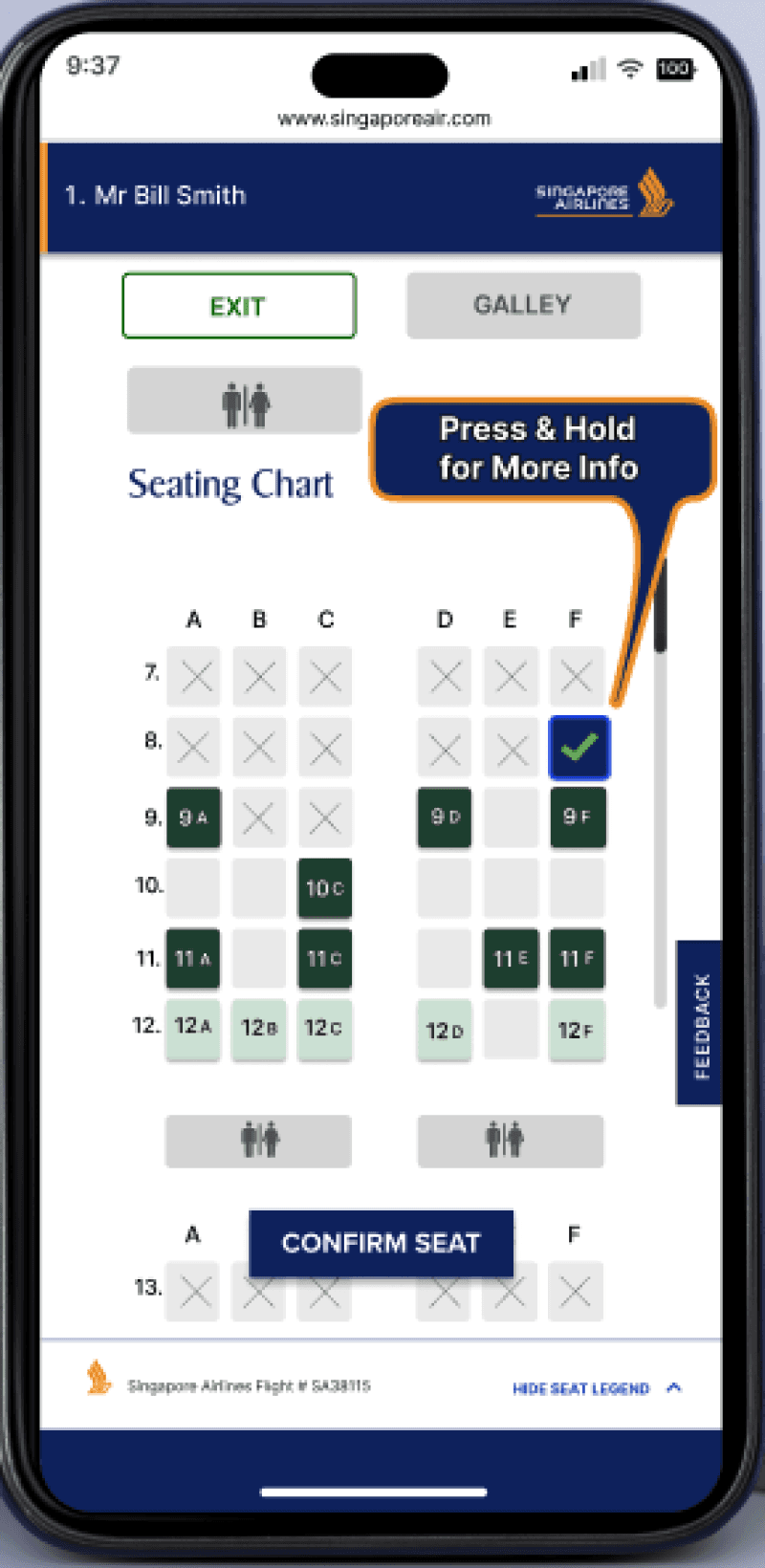
Get-A-Glimpse would provide usable information pertaining to legroom, seat reclining range, infotainment systems, movie titles, storage, charging capabilities, lavatory’s and more, all important features one could use to help when selecting airline flight seats.
Final Design
A feature that provides a series of useful info at time of seat selection
The Solution
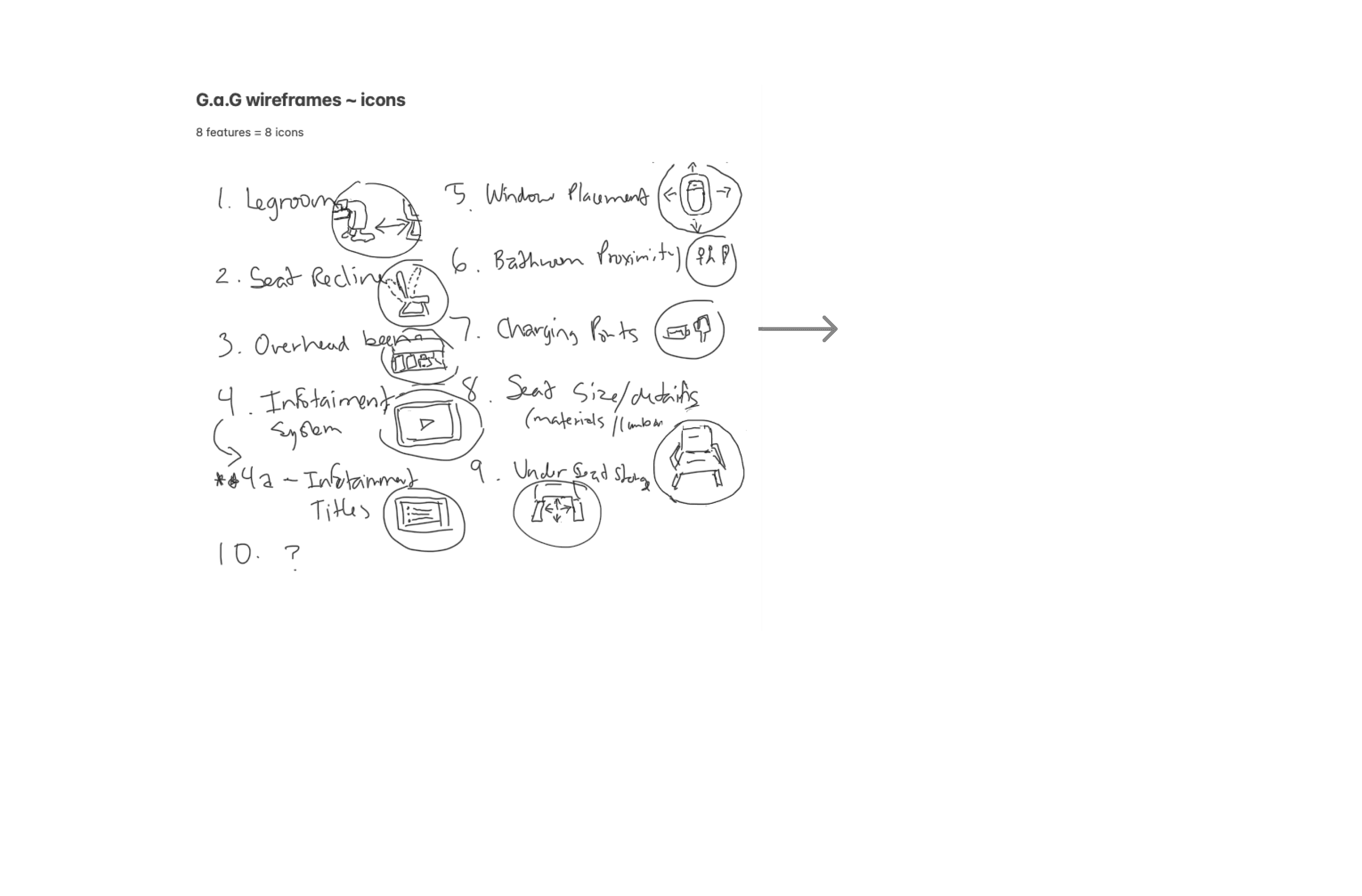


Icon Development
Primary Colors
Primary 1
#2D2E2A
Primary Colors
Primary 2
#E9A57F
Primary Colors
Primary 3
#FFFFFF
Secondary Colors
Secondary Color 1
#7C7C7C
Secondary Colors
Secondary Color 2
#DEDEDE
Secondary Colors
Secondary Color 3
#F3F1FF
VISUAL SYSTEM
Colors -
Typography -
Iconography
Misc Elements
Buttons
48 px
32 px
28 px
18 px
16 px
Termina
Heading 1
Heading 2
Heading 3
Body Large
Body
Body Small
Body Large (Bold)
Body (Bold)
Body Small (Bold)
Link Large
Link Here
PROTOTYPING
PROTOTYPING
Test: Validation, Usability, Feedback
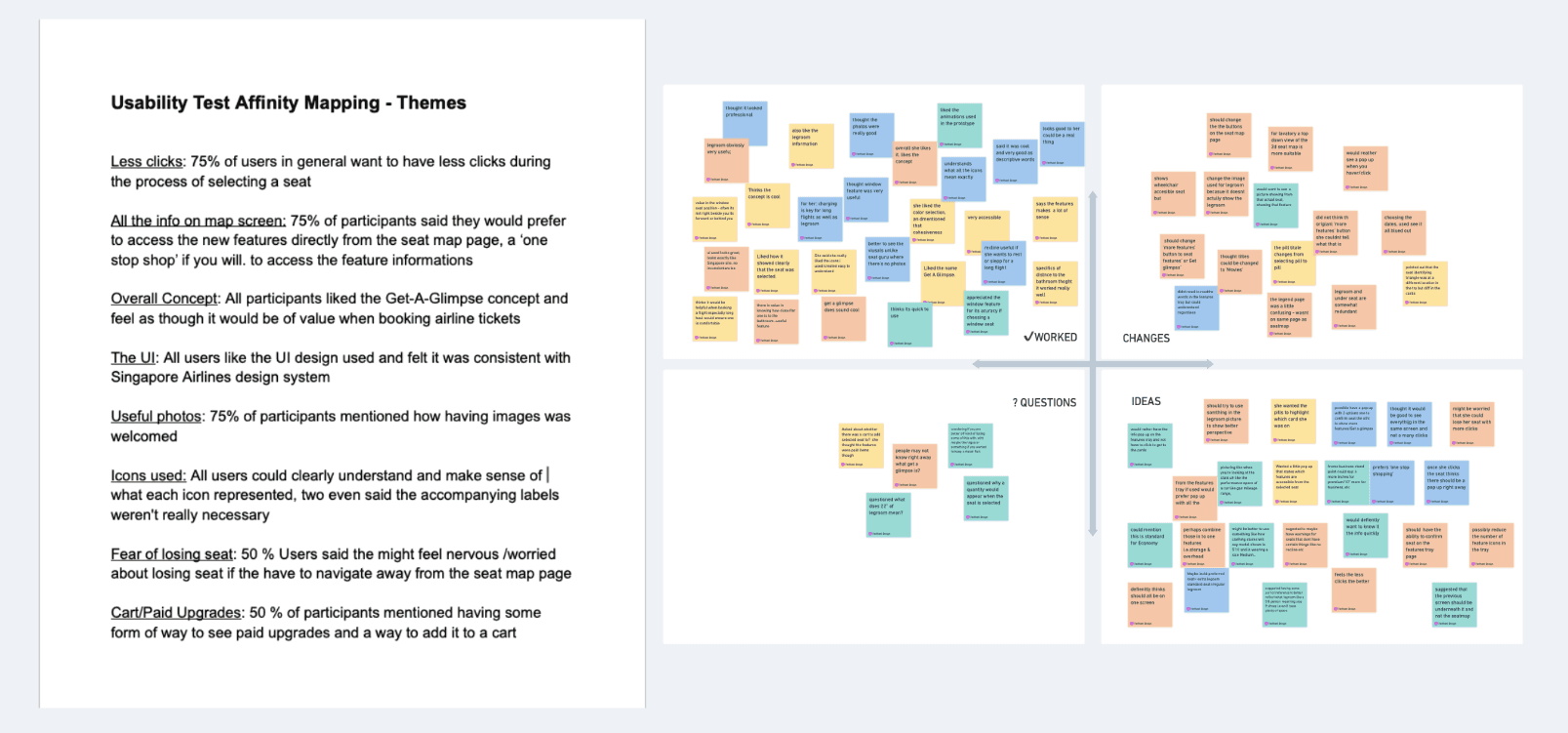
The goal for moderated usability test for the mobile functionality was to learn how easy it is for users to access the features understand which each feature and accompanying icon was and could they successfully complete the task of selecting a seat aided by the new features. I also learned if the users enjoyed or were happy with the new available features and also what they did not like or would wish to change. I conducted teh test using Lokkbak io as well as zoom.
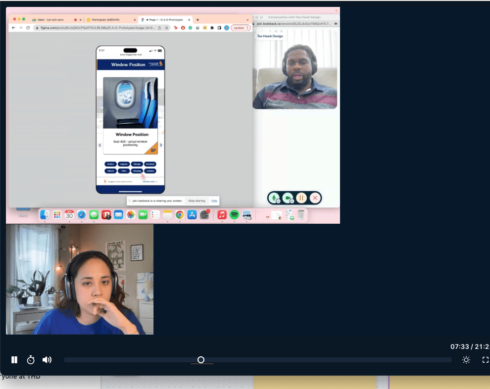
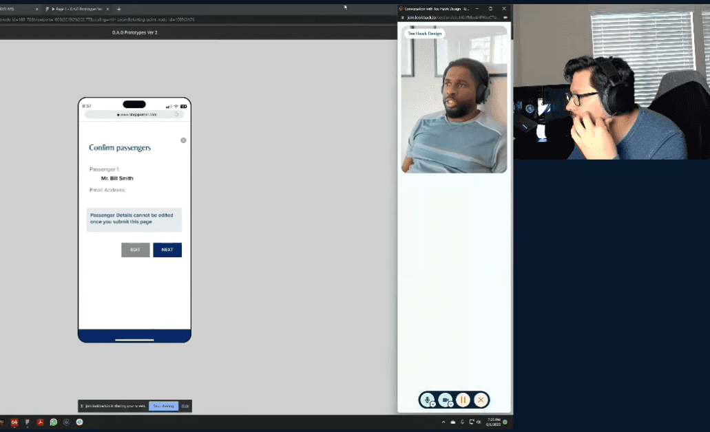
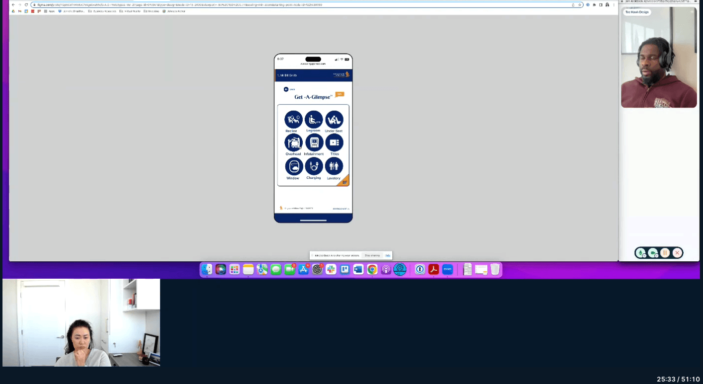
USER TESTING
Iterations were needed to improve the overall design and with the help of the usability test results I was able to get valuable feedback needed to make the necessary changes to the designs. Key changes to the Get-A-Glimpse icon tray, removal of the pills and the ability to see all the features from the seat map screen to name a few were implemented. Some minor revisions were also made as well.
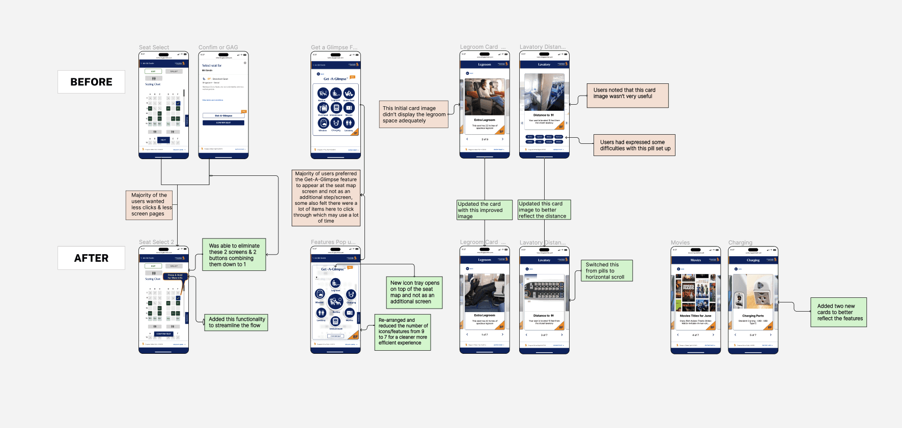
Iterations
Design Changes
Hi Res Screens
VISUAL SYSTEM
See next projects
back to top
Lets Connect!
Anthem Tattoo
Design Challenge
Get-A-Glimpse
DESIGN